Showing posts with label Draft. Show all posts

Saturday, 19 March 2016

Evaluation part 7 (draft)

Looking back at your preliminary task (the school magazine task), what do you feel you have learnt in the progression from it to full product?

Before completing my preliminary magazine i had no previous knowledge of key magazine conventions. This was evident in my preliminary magazine does not follow or replicate magazine conventions and structures. The preliminary magazine i created was a simple magazine with few layers and little thought of how it would attract my target market.

Not only have my ideas and knowledge of design conventions developed, but so to has my camera work. With my knowledge of mise en scene and framing developing too, an understanding which wasn't there at the time i created my preliminary school magazine. The new development in understanding these conventions has helped me to create, what i feel is a successful realistic magazine which would appeal to its target market. For example my understanding how clothing and the look of the model can influence the audience and the look of the magazine was something that i had not given a great amount of thought to when creating the preliminary magazine. However this is something that i began to understand more and something that i wanted to get right when it came to my actual magazine, which i feel did happen in the end, as the clothing and look of my model/artist 'Jake Goodfeller' made him look like a real indie/alternative rock artist, and also made him appeal to my target audience. 

As well as mise en scene and framing, my understanding of variety has also developed since the preliminary magazine. This is made clear by how in the 'prelim' most shots were from the same distance and of the same model. This was also the case with my draft magazine. However this is something i changed in my final magazine, by incorporating more than one model and a variety of different shot types like; close up, mid shots and long shots.

Wednesday, 16 March 2016

Evaluation part 6 (draft)

What have you learnt about technologies from the process of constructing this product?

During all of the processes carried out to achieve my final media product: Faction, the indie/alternative rock music magazine, I used and learnt various techniques that aided me in achieving the content and aesthetic that i desired, that would appeal to my target audience. The most heavily used piece of technology during the creation of my media product was photo editing software, Adobe Photoshop. This was used to create all of the pages in the magazine. After already having a experience using Adobe Photoshop, i did not learn anything regarding the features and tools it offers. However one area that i did learn a great deal in using was that of SLR camera, Nikon D200. Having used this specific model of camera to take all of the photos both used in my magazine and not used in my magazine. After having no background knowledge of taking photos with professional cameras to produce good quality images, i had to learn about features that the camera offers, for example; auto focus, shutter speed, flash and imaging framing, amongst others. The features that i eventually learnt how to use helped me achieve an end product that i was pleased with.

Sunday, 13 March 2016

Evaluation part 5 (draft)

How did you attract/address your audience?

To attract and address my audience i used a variety of techniques on the; front cover, contents page and double page spread of my indie/alternative rock magazine, Faction. With my target audience holding personal image as a very important principle, i felt that a good way to attract the audience would be to make an aesthetically crisp and clean magazine, features of which are sought after regarding my target markets individual appearance. 


Features that i have included to try and achieve a look that will appeal to my target audience include a minimalistic look, with no dense amounts of text, most features centred to give a uniform look, something that is also achieved with the serif text, applying a certain degree of formality to the page a look that will appeal to my target audience. This will appeal to them as it links with their hobbies, dress sense and general culture. This not only applies to my front cover but also to the contents page and double page spread. With all pages in uniform and all following a specific design, achieved by using rulers during the design stage. This is also the case with the double page spread. As everything fits into place perfectly, achieving the crisp, clean look that i set out for, because it attracts my target audience.


Thursday, 10 March 2016

Evaluation part 4 (draft)

Who would be the audience for your media product?

The audience of my magazine features members of the social groups; Stylers, Young alts and New casual, between the ages of 16-30, and targeting 80% of men that fit into these descriptions. I felt this was a good choice of target audience as people in the age band of 16-30 are more prone to listen to music. Also at this stage of life individuals begin to find their own tastes rather than simply following crowds to seem popular or cool, this is a key feature of my magazine, and a point that the magazine is heavily dependant on as the genre of music that it focuses on (indie/alternative rock) and its artists commonly have this mentality. The magazine will try to attract 80% of males that meet the criteria, I feel that the male population that fit into the social groups specified previously and between the ages of 16-30 listen to indie/alternative rock music more than that of females who fit the criteria. This is backed up with my research from an audience survey that showed 4/5 17-18 year old males would be interested in buying and reading the magazine, whereas only 1/5 females would be interested.

As the social groups i have decided to focus on, rely heavily on image, much like indie/alternative rock music artists i feel this appeals more to males than females. With male clothing very much judged by brand, rather than looks, like female clothing. A factor that is evident when analysing the prices that both artists and fans of the indie/alternative rock music genre pay for high end brands such as; Fred Perry, Ralph Lauren, Adidas Originals (Footwear), Fila Vintage, Lyle and Scott, Pretty Green and Ellesse. Brands of which have been sported by Oasis, The Stone Roses and Jake Bugg, amongst countless others. 

Music and Fashion aside, the hobbies of my target market are typically undergone in the company of others that fit into the criteria of my target market. The hobbies that they usually enjoy other than listening to music includes; drinking, smoking, watching football and in some cases fighting. These activities are something i tried to link with in my article and magazine, making it appeal more to my audience.

Monday, 7 March 2016

Evaluation part 3 (draft)

What kind of media institution might distribute your media product and why?


Tuesday, 1 March 2016

Evaluation part 1 (draft)

In what ways does your media product use, develop or challenge forms and conventions of real media products? (i.e. of music magazines)

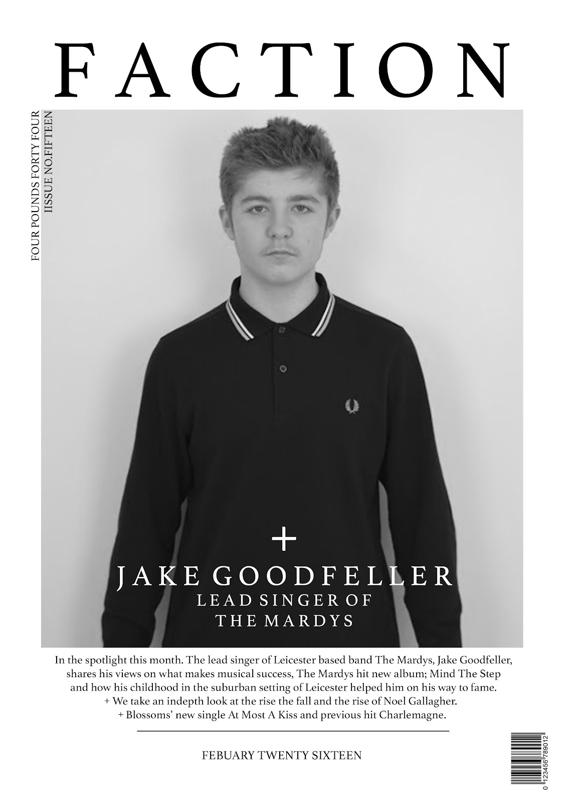
My masthead ‘Faction’ uses the font ‘Athelas’. This is a serif font that is not popular in the music magazine industry, and therefore could be seen as a feature that challenges forms and conventions regarding masthead font. The only well known music magazine that uses this type of font is ‘Q’. A magazine that despite using a serif font in the masthead, is not made apparent to a sizeable effect, due to the title being only one letter. This is another different feature, as my magazine’s title is ‘FACTION’. This means a small organised dissenting group within a larger one, especially in politics, the meaning of the word was the main reason i chose the name, as it shows rebellious trends and different ways of thinking. Both of which are traits in the indie rock music genre (my chosen genre), as they tend to defi musical conventions that are typically set in the genre of pop.




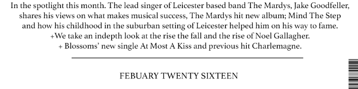
The graphology on my front cover is that of a simplistic nature; as all images and text apart from the issue number and price is centered. This allows the reader or potential customers eyes to first start at the top, where my masthead is situated, then directly downwards towards a portrait image of my featured artist ‘Jake Goodfeller’ and text stating his name and the band he is lead singer of, and further downwards to a brief summary of the contents page and the date. Both the masthead, cover line and main body of text are in the same font (‘Athelas’). This font offers a crisp, intelligent look to the magazine, which is likely to attract the eye of potential customers on a shelf due to the colour of the text mirroring my monochrome colour scheme set for the rest of the magazine, as all text is black or white and features on contrasting backgrounds, to make text easy to read at a distance, something that is important if it is going to attract my target audience.


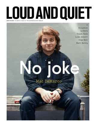
The white background used in my front cover pulls the page together, by making all of the text stand out. The size of the various bodies of text used on my front cover is linked with importance. For example the masthead, the most important piece of text that is on the page, that allows customers and readers to identify the brand and the magazine, is 86 pt. Whilst the cover line, of which describes  the main featured article of the magazine, is in font size 30, and the brief summary of the contents page is 12 in font size. All of these features i have used (background,text colour and text size) on my front cover follow typical conventions. This is due to the effectiveness of these methods that result in an aesthetically crisp and an image that draws attention, this is why it is adopted by many popular music magazines and magazines that focus on other areas e.g. fashion etc, covering a wide spectrum of genres. For example magazines ‘Loud And Quiet’ and ‘Fantastic Man’ both adopt this method, to attract potential customers eyes and appeal to the target audience. The overall design of my front cover fits together rather well, the sizing of most elements including images, text and the barcode replicate that of other successful magazines and therefore follows typical conventions.


Faction front cover jpeg.jpg


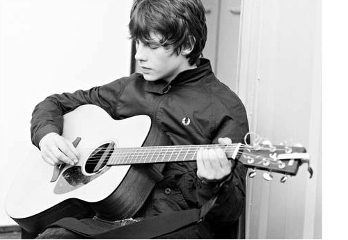
In my magazine i have two models, Jake Goodfeller; of whom my double page spread focuses on, and Josh Harrow, who features on the contents page and would also have an article about him further in the magazine. ‘Jake Goodfeller’ is styled in 3 different outfits all of which include ‘casual football’ brands, that are worn by and appeal to my target audience (as explained in my research). The items worn include; navy Fred Perry long sleeve polo, white Pretty Green short sleeve polo, black Pretty Green festival jacket, black and white Adidas Originals superstar track bottoms and black and yellow Adidas Originals Hamburg.Whilst my second model/artist, ‘Josh Harrow’, is wearing skinny black jeans and a black Fred Perry hooded jacket. The clothing modelled in my magazine is also modelled by numerous artists in the same genre, with Pretty Green being ex oasis star, Liam Gallagher’s own brand. Younger artist, Jake Bugg, is also seen regularly in Fred Perry. My featured artist Jake Goodfeller does not look out of place in an indie/alternative rock magazine, his features do not differ substantially from other indie/alternative rock artists (despite ageing), whilst his build is also similar to these artists.